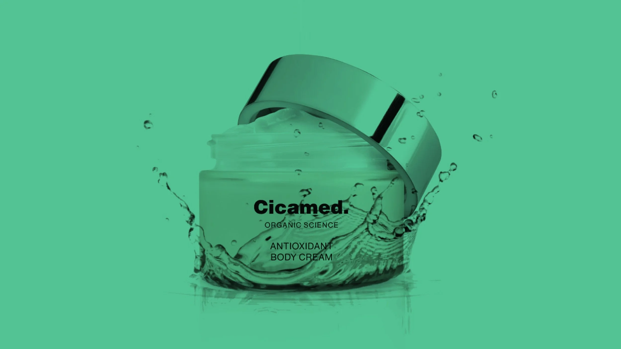
Cicamed
Back to the elemental.
Cicamed had always stood for a rare balance — where organic ingredients meet clinical insight. But over time, that quiet strength had been obscured by a visual language that no longer reflected the brand’s clarity or ambition. The challenge wasn’t reinvention. It was reduction. A return to the core.
In this speculative exploration, our work focused on distilling what was already there — refining the identity, sharpening the story, and outlining a brand expression that resonates with a modern, conscious beauty buyer. One who values substance, clarity, and care over trends and noise.
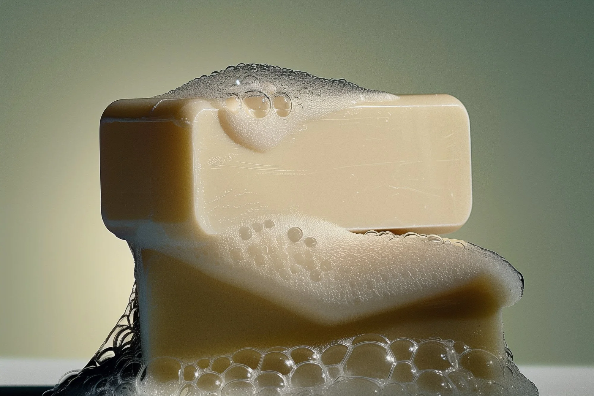
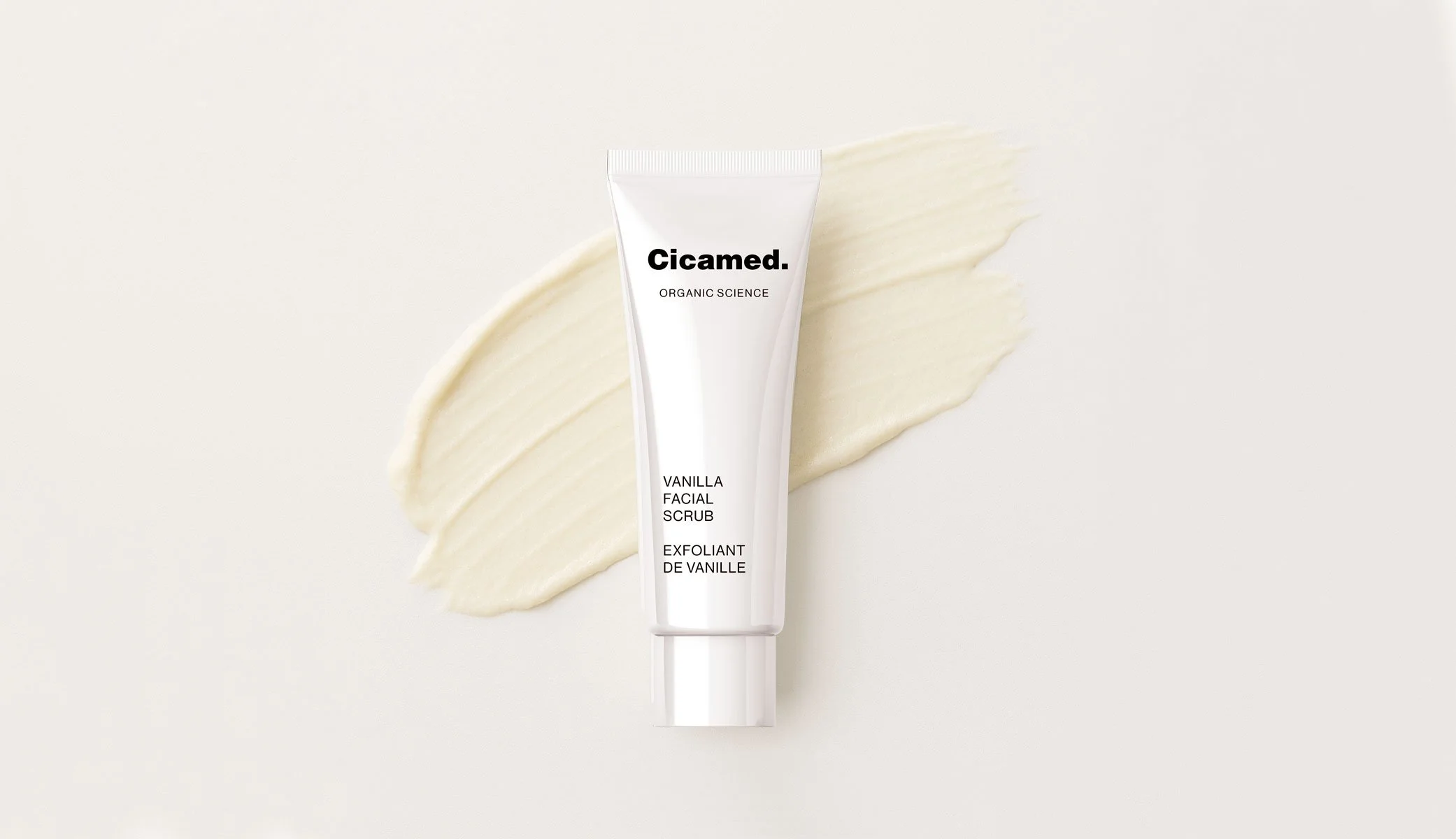
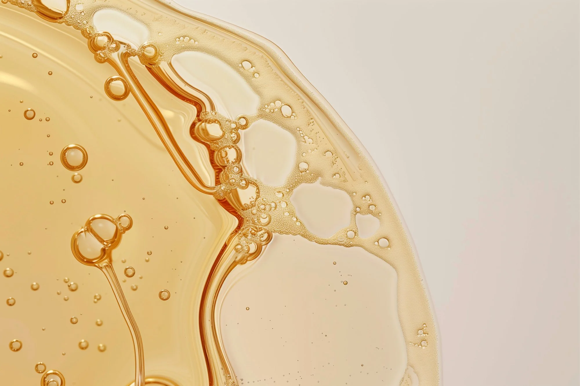
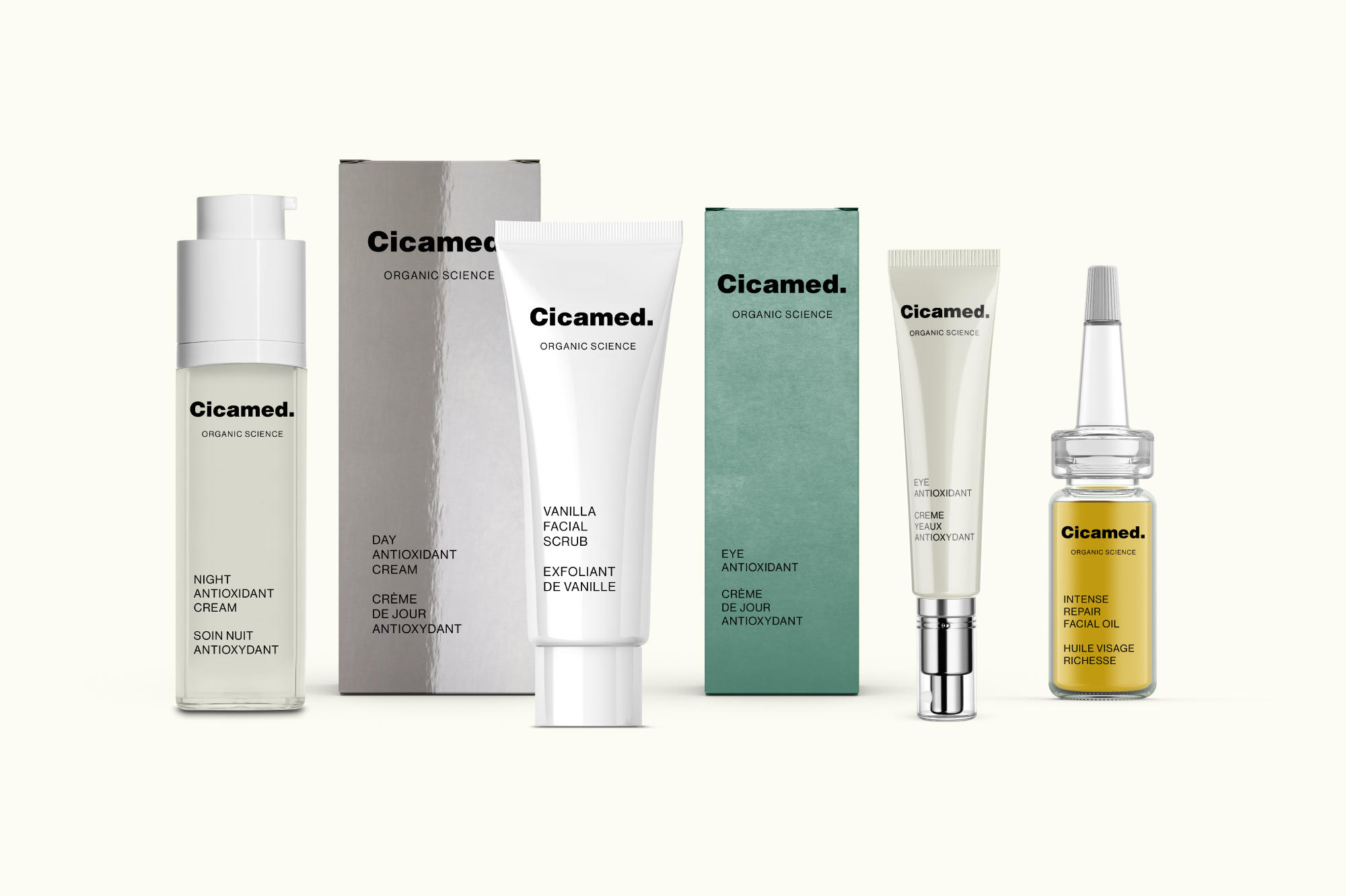
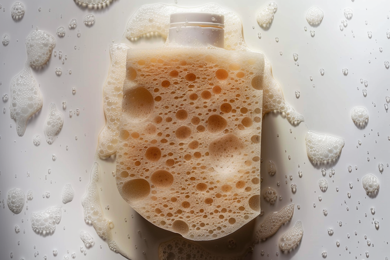
We redefined the tonality: confident but calm, intelligent without being cold, honest without the hype. Visually, we proposed a new form language and packaging direction — elemental, structural, tactile. A system that speaks in materials and proportion, not decoration.
At its core, the exploration was about alignment. Revealing the brand’s true character — and imagining a voice and presence that feel as pure and precise as the formulas themselves.
Cicamed.
ORGANIC SCIENCE
Cicamed.
CICAMED ORGANIC SKINCARE IS A SWEDISH BRAND COMBINING NATURAL INGREDIENTS WITH DERMATOLOGICAL EXPERTISE. FREE FROM HARSH CHEMICALS, IT'S GENTLE, EFFECTIVE, AND IDEAL FOR SENSITIVE SKIN.